21 free design tools that stop your AI-built website looking like every other one
Most AI-built websites look the same. 21 free tools — inspiration galleries, DESIGN.md style files, UI blocks, motion and visuals — sorted by each step of a build.

Most AI-built websites look the same.
Purple gradient. Same font. Three feature cards. You've seen it a hundred times — and so have your visitors.
The problem isn't the AI. It's that we give it no design direction. Ask for "a modern landing page" and you get the average of every landing page it has ever seen.
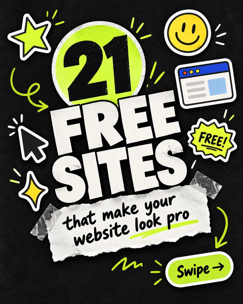
Here are 21 free tools I use to fix that, sorted by each step of a build:
- Find your look — start from a real design
- Teach your AI your style — one style file it follows
- Build sections fast — ready-made blocks
- Add motion — small animations
- Add the finishing touches — maps, UI details, glass effects
- Free visuals — illustrations and 3D icons
1. Find your look
Copy the vibe, not the code. Start from a real design you like, not a blank prompt.
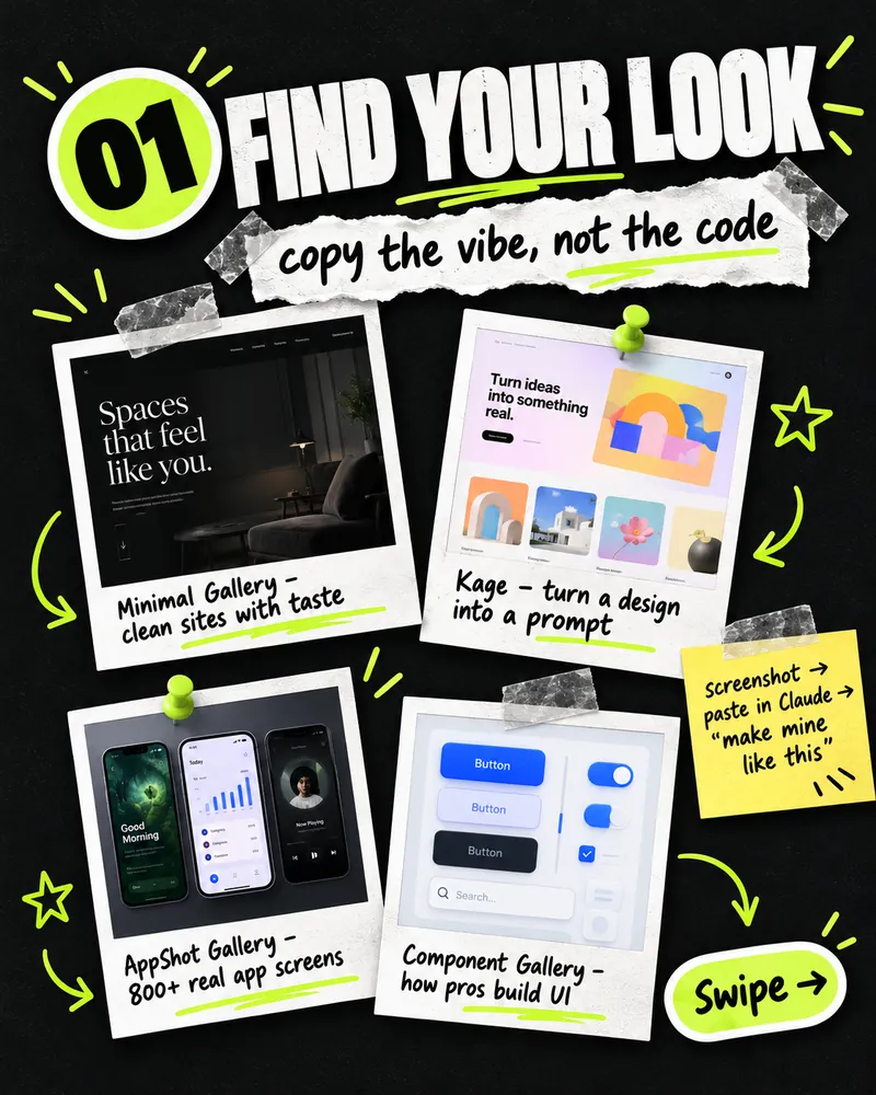
- Minimal Gallery — a hand-picked collection of clean websites with taste. Good for finding a calm, premium direction.
- Kage — turn a design you like into a prompt you can give your AI.
- AppShot Gallery — hundreds of real app screens, useful when you're designing dashboards or mobile layouts.
- Component Gallery — see how real design systems build buttons, tabs, modals and more.
Quick trick: take a screenshot of a section you like, paste it into Claude, and say "make mine like this — same layout and spacing, my content and colours." Use the design as a reference, not something to clone.
2. Teach your AI your style
One file = no more random colours.
This is the step most people skip — and it's the one that matters most. A DESIGN.md file is a short document in your project that tells the AI your exact colours, fonts, spacing and component styles. Once it's there, the AI stops guessing and every new page matches the last one.
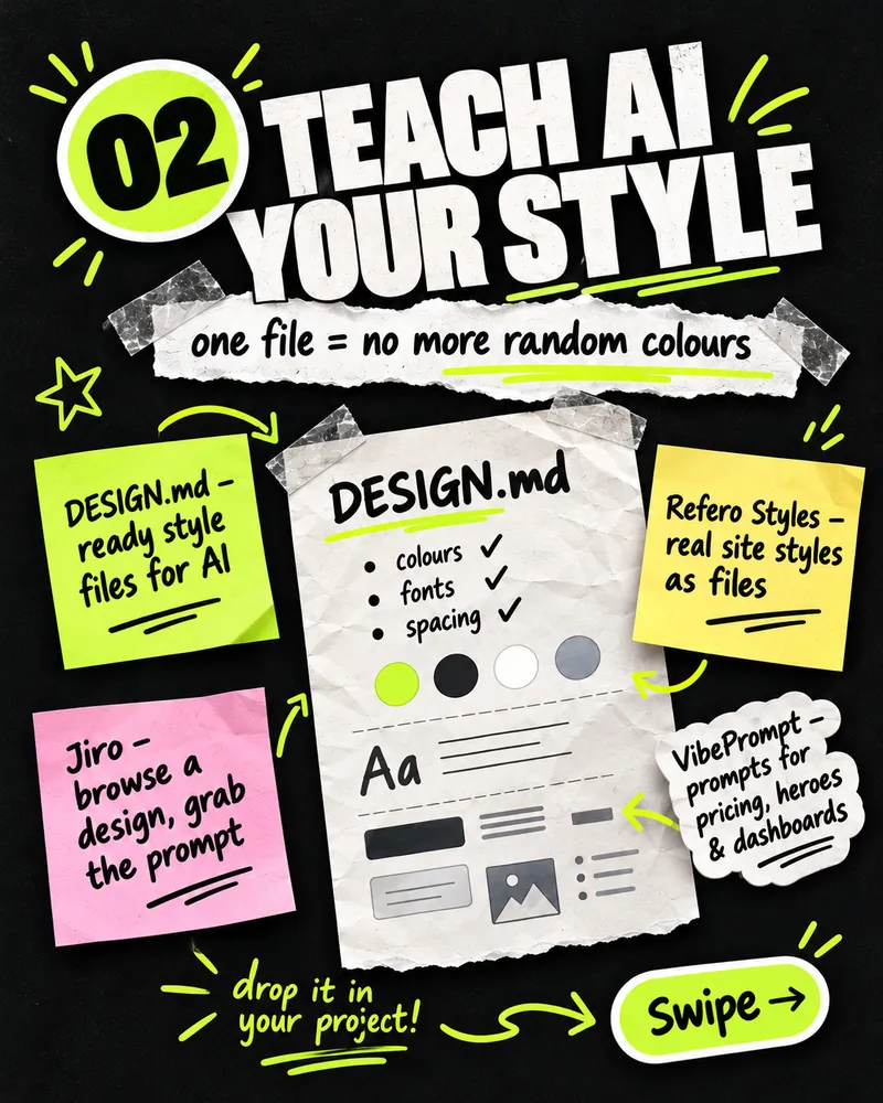
- DESIGN.md — ready-made style files for AI that you can drop into your project.
- Refero Styles — styles from real websites, as files.
- Jiro — browse a design and grab the prompt behind it.
- VibePrompt — prompts for common sections like pricing tables, heroes and dashboards.
A DESIGN.md doesn't need to be long. Even this much makes a big difference:
# Design

## Colours
- Brand: #0066ff (buttons, links, highlights only)
- Text: #0b1220 · Muted text: #5b6475
- Background: #ffffff · Surface: #f5f7fb · Borders: #e3e8f0

## Type
- Font: Space Grotesk, 400-700
- Headings tight (line-height 1.1), body 16-18px, line-height 1.6

## Spacing & shape
- 8px spacing scale; sections 96px apart on desktop, 64px on mobile
- Corner radius 12px on cards, 999px on buttons

## Rules
- No gradients on text. No more than one accent colour per section.
- Every section has one clear heading and at most one primary button.
Then tell your AI: "Read DESIGN.md before you build anything, and follow it exactly." (If you use Claude Code, you can point to it from your CLAUDE.md so it's read every time.)
3. Build sections fast
Stop making buttons by hand. Ready-made heroes, navbars, pricing tables and footers.
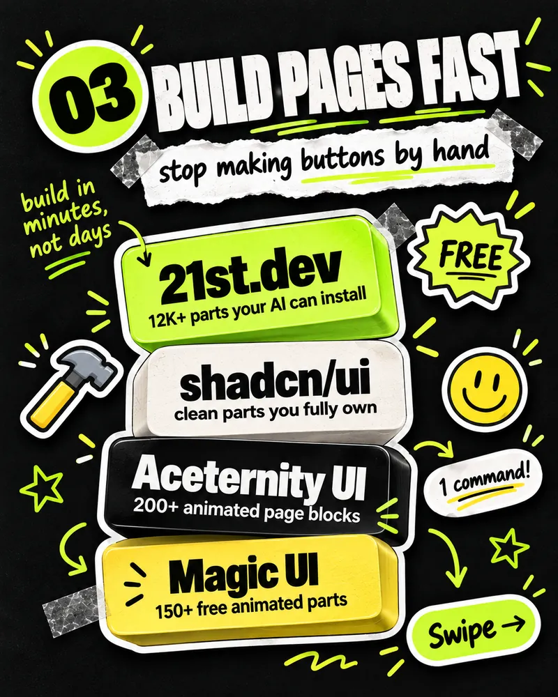
- 21st.dev — a huge library of community UI components your AI can install for you.
- shadcn/ui — clean, accessible components that are copied into your project, so you fully own and can change the code.
- Aceternity UI — animated page sections for eye-catching landing pages.
- Magic UI — free animated components, built to work alongside shadcn/ui.
Most of these are built for React and Tailwind CSS. If your site uses plain HTML or WordPress, you can still use them as a reference — ask your AI to rebuild the section in your own stack.
4. Add motion
Static sites feel boring. Small animations make a site feel alive.
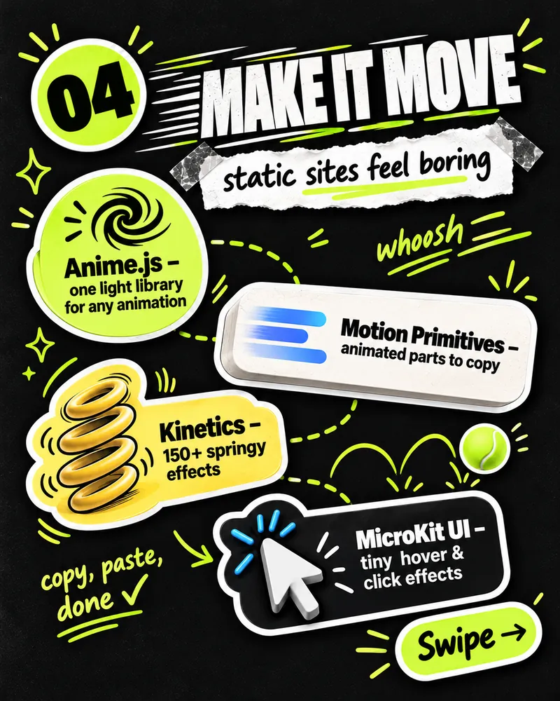
- Anime.js — one light JavaScript library for almost any animation.
- Motion Primitives — animated components to copy into your project.
- Kinetics — a collection of springy, playful effects.
- MicroKit UI — tiny hover and click effects that make buttons feel responsive.
A word of caution: less is more. Animate a few things that matter — a hero, a button, cards fading in on scroll — not everything at once. Respect visitors who turn motion off (prefers-reduced-motion), and check your page speed afterwards. Heavy animation can hurt Core Web Vitals.
5. Add the finishing touches
Tiny details, big first impression.
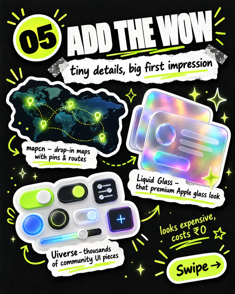
- mapcn — drop-in maps with pins and routes, in the shadcn/ui style.
- Uiverse — thousands of community-made UI elements: buttons, toggles, loaders, inputs.
- Liquid Glass — that premium Apple-style glass effect.
Use these as accents. One glass card or one custom toggle looks premium; a whole page of them is hard to read.
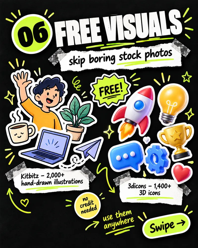
6. Free visuals
Skip boring stock photos.
Before you use any free asset on a client or business site, read its licence page — most allow commercial use, but terms can differ.
My simple workflow
Find a design → turn it into a style file → build with ready parts → add motion and polish.
In practice, my brief to the AI looks like this:
Build the homepage for [business]. Read DESIGN.md first and follow it exactly.
Layout reference: the attached screenshot (match the structure and spacing, not the content).
Sections: hero, 3 services, client logos, testimonials, contact form.
Use shadcn/ui components where they fit. Add a subtle fade-in on scroll, and respect prefers-reduced-motion.
No purple gradients, no stock-photo people.
The tools help, but the real fix is the order: decide how the site should look before the AI starts building. (It's the same idea as defining the outcome instead of prompting step by step.)
Which one are you trying first?
Pick one tool from step 2 — a style file is the fastest way to make your next AI-built page look like yours.
Want a website that doesn't look AI-generated?
At Bitlence we design and build websites with a real design direction from day one — custom layouts, your brand, fast and accessible. See our web development services, or tell us about your project.