Nobody reads your website. They scan it — 5 fixes that keep visitors
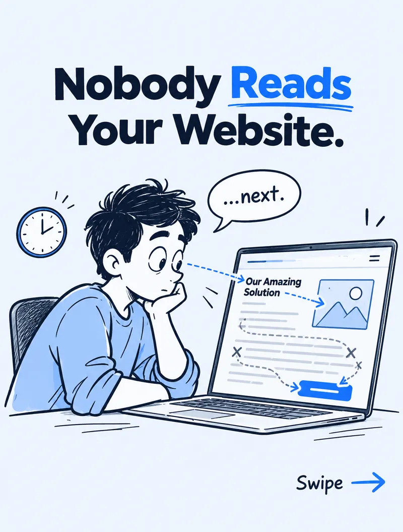
Visitors decide in about 5 seconds whether to stay. Clear navigation, a one-line hero, logical flow, visual hierarchy and one CTA make that scan work.

Most websites are designed for how we wish people behaved: reading every line, top to bottom, the way we wrote it.
Real visitors don't do that. They skim. Their eyes jump between headlines, images and buttons, and within about five seconds they decide whether to stay or hit the back button. Long-standing eye-tracking research from the Nielsen Norman Group has shown the same pattern for years: people scan in an F-shape and read only a small share of the words on a page.
So instead of designing for readers, design for scanners. Here are the five changes that make the biggest difference on the websites we build and fix.
1. Clear navigation
Use labels people already recognise: Home, About, Services, Work, Contact. Nobody should have to guess where a link leads.
Clever menu names like "Solutions", "Explore" or "Ecosystem" feel original to the team that wrote them, but to a first-time visitor they are a puzzle. Every guess costs attention — and attention is what they ran out of in those five seconds.
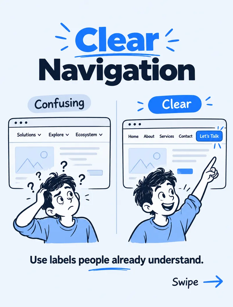
Quick fixes:
- Keep the main menu to five to seven items.
- Name pages by what they contain, not by internal jargon.
- Put the primary action (like "Start a project") as a button on the right, so it stands apart from the links.
2. A clear hero message
The first screen of your homepage has one job: say what you do, for whom, in one sentence. If visitors have to figure it out, they won't.
"We build amazing digital solutions" says nothing. "Modern websites that grow your business" tells a visitor in two seconds whether they are in the right place. Add one supporting line underneath and a single button — that's it.
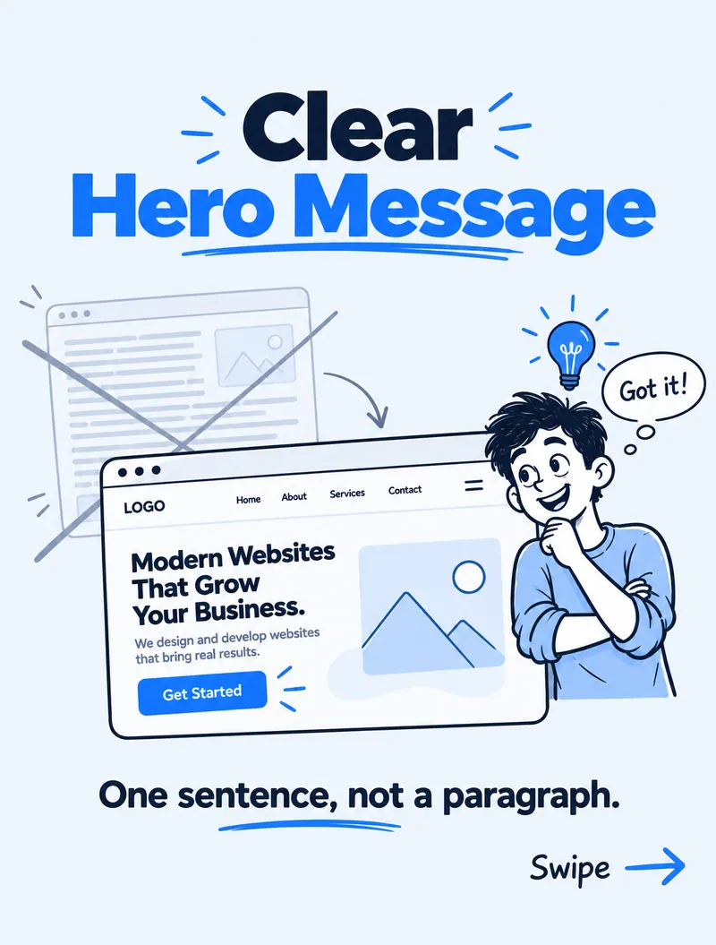
Test it: show your homepage to someone for five seconds, close it, and ask what the business does. If they can't tell you, the headline needs work.
3. Logical flow
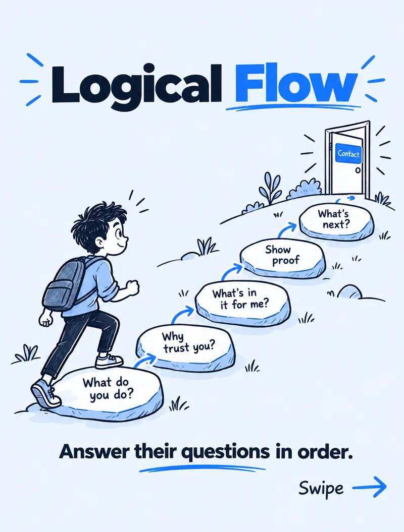
Every visitor arrives with the same questions, in roughly the same order:
- What do you do? — the hero.
- Why should I trust you? — client logos, experience, reviews.
- What's in it for me? — services and outcomes, written as benefits.
- Can you prove it? — case studies, portfolio, results.
- What's next? — one clear way to get in touch.
Answer them in that order and the page feels effortless to scroll. Jump around — pricing before trust, contact before proof — and visitors leave with questions nobody answered.
4. Visual hierarchy
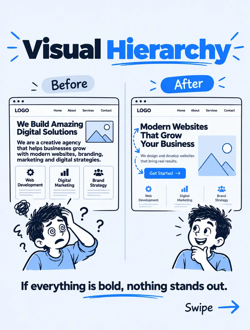
Size, colour and spacing should show what matters most. If everything is bold, nothing stands out.
A scanner's eye goes to the biggest, highest-contrast thing first. Use that on purpose:
- One large headline per section, with smaller supporting text.
- Your brand colour reserved for actions — buttons and key links — not decoration.
- Generous white space, so each block reads as its own idea.
- Short paragraphs and lists instead of walls of text.
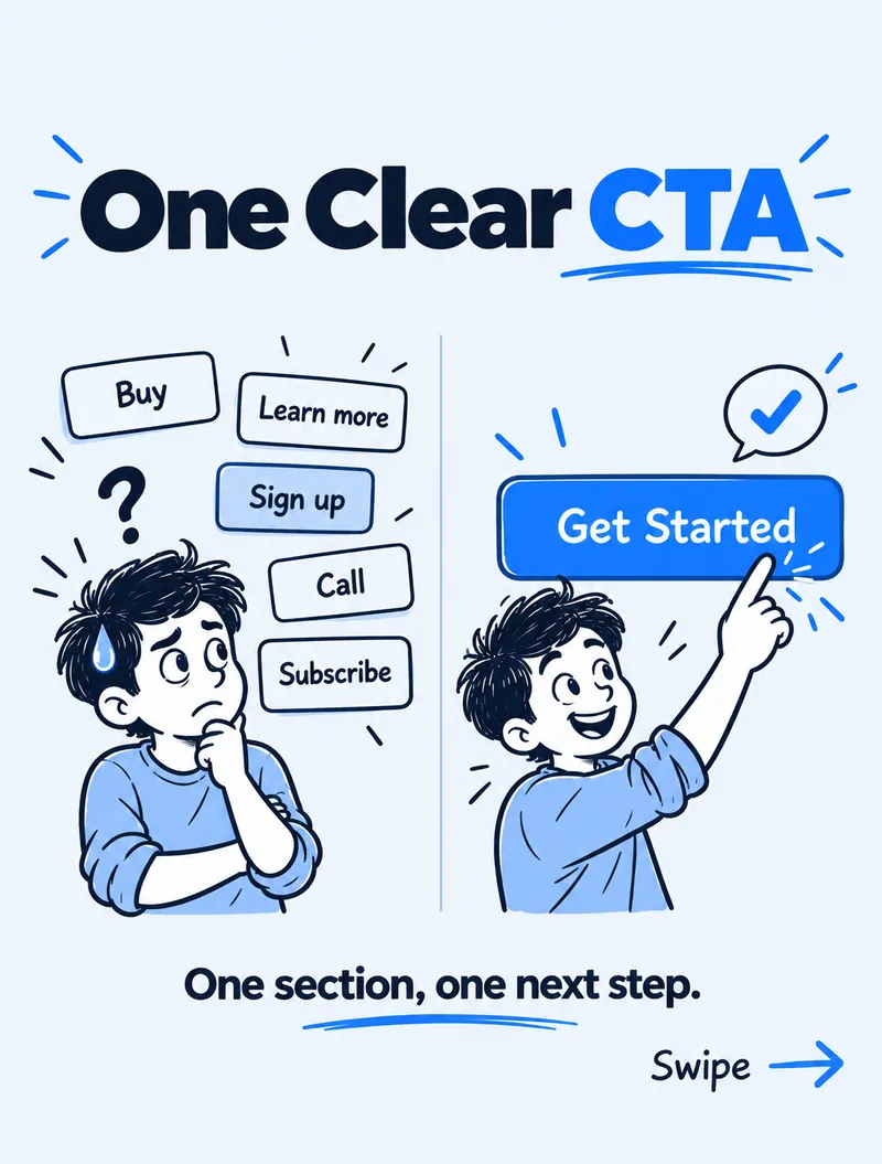
5. One clear CTA
One section, one next step. "Buy", "Learn more", "Sign up", "Call" and "Subscribe" side by side create hesitation — and hesitation kills conversions.
Pick the single action that matters most for that section and make it the obvious button. Secondary options can be plain text links. On a services website, that main action is usually "Get a quote" or "Start a project", repeated at natural stopping points down the page.
Confusion anywhere leads to drop-off everywhere
None of these fixes needs a full redesign. Renaming menu items, rewriting one headline, reordering sections and removing extra buttons can be done in a day — and they often do more for enquiries than a new colour scheme ever will.
Design for the five-second scan. If the scan works, the people who do read will stay.
Want a free 5-second homepage audit?
Send your website link through our contact form or DM "AUDIT" on Instagram, and I'll tell you what your homepage says in a five-second scan — and what to fix first. If you're planning a new site, see our web development services.